In this Article, we will see how to create a Toast Component and make it customisable by allowing for different types and positions.
First of all we are going to create a Component File in resources/views/components/ directory. We are going to call it alert.blade.php and we can call it in Blade File using below syntax
<x alert></x alert>
We are going to pass the message that we want to display in between the 2 tags.
<x alert>You are Logged in!</x alert>
This message will be available to the component as $slot variable.
<div>
    {{$slot}}
</div>
Let us design it using some Tailwind CSS Classes.
<div>
    <div class="bg blue 500 border blue 700 max w xs text white rounded lg px 4 py 2">
        {{$slot}}
    </div>
</div>
We have applied following classes:
- bg blue 500: This gives a background color of Blue Shade.
- border blue 700: This gives a border of slightly darker Blue Shade.
- max w xs: This limits the maximum widht that div can take.
- text white: This gives the white color to the message
- rounded lg: This gives the border radius to the div.
- px 4 py 2: They give a padding to the div.
At this stage our alert component is displayed depending upon where it is rendered in the Blade File. However, we want to display it in a fixed position at bottom right of the screen. To do this, we will give Tailwind CSS Classes to the outer div.
<div class="bottom 4 right 4 fixed">
    <div class="bg blue 500 border blue 700 max w xs text white rounded lg px 4 py 2">
        {{$slot}}
    </div>
</div>
fixed class gives it a fixed Position and bottom 4 and right 4 place it at the bottom right of the screen. At this stage we can include our Component anywhere in our Blade File and it will display at the bottom right of the screen.
Lets make our Component a bit more flexible. Currently it only display every message in Blue Shade. However, we want to support error, warning and success message type along with the info message type which will be default. We are going to add type as @props. And we are going to change the CSS classes based on the type property.
@props(['type' => 'info'])

@php
    $typeClasses = [
        'info' => 'bg blue 500 border blue 700',
        'warning' => 'bg yellow 500 border yellow 700',
        'error' => 'bg red 500 border red 700',
        'success' => 'bg green 500 border green 700',
    ][$type];
@endphp

<div class="bottom 4 right 4 fixed">
    <div class="{{$typeClasses}} max w xs text white rounded lg px 4 py 2">
        {{$slot}}
    </div>
</div>
Now we can call our Alert Component by passing type as follows:
<x alert type="error">Record was not Saved.</x alert>
And the Component will be displayed with a shade of red color. If you do not pass any type, it will default to info.
Similarly, we are going to allow our Component to take position as props. We will support 4 positions, bottom right, bottom left, top right, top left. Our Component will look like this.
@props(['type' => 'info', 'position' => 'bottom right'])

@php
    $typeClasses = [
        'info' => 'bg blue 500 border blue 700',
        'warning' => 'bg yellow 500 border yellow 700',
        'error' => 'bg red 500 border red 700',
        'success' => 'bg green 500 border green 700',
    ][$type];

    $positionClasses = [
        'bottom right' => 'bottom 4 right 4',
        'bottom left' => 'bottom 4 left 4',
        'top right' => 'top 4 right 4',
        'top left' => 'top 4 left 4',
    ][$position]
@endphp

<div class="{{$positionClasses}} fixed">
    <div class="{{$typeClasses}} max w xs text white rounded lg px 4 py 2">
        {{$slot}}
    </div>
</div>
You can try by calling the component as follows:
<x alert type="error" position="top right">
    Profile was saved successfully.
</x alert>
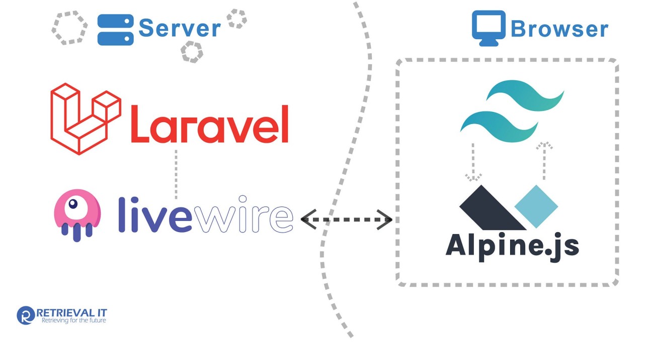
And we also want User to close this Notification when they click on it. we are going to use AlpineJs for it. We will create a show property and use x show directive to change the display of our Component. Using the @click directive we will change the value of show to false. We will also use the class cursor pointer to change the Cursor to Pointer.
<div class="{{$positionClasses}} fixed cursor pointer"
    x data="{show:true}"
    x show="show"
    @click="show=false"
>
And with that our Component is complete and we can use this Component anywhere in our Laravel Project. If you are interested in more complex implementation using Livewire, please check out this package.
Hope you have enjoyed this tutorial. For similar articles, you can follow me on Twitter
